Tuesday, October 19, 2010

Redesigned website

My website has been outdated for quite some time now and I really wanted an easier-to-maintain solution. I found Wix not too long ago and they allow for advanced-looking sites with no coding knowledge needed. Right up my ally.

As a graphic designer, I always hated the website building process. It's like the two sides of my brain would refuse to talk to each other. I need to be able to see what I'm doing in real time just to make sure it looks good. I can't be bothered to remember if I forgot a /bold tag or not.

Wix is a simple drag and drop editor that doesn't make you stay locked into templates like most WYSIWYG editors out there. OK, that was my plug for Wix. They're not giving me anything for it and I don't get anything if you decide to sign up. It's just something that worked for me.

So check out my new site Solis Photography to see what I done.

Oh, so you want a photo to go along with this post? OK, here ya go:


Steamer Lane

Saturday, October 09, 2010

Shooting Sports

Lately I've been shooting a lot of surfing and I've added a few more skills to my repertoire: football and baseball photographer.

I wanted to get another chance at shooting a professional football game so I asked (begged) my wife, who is the sports editor of the Santa Cruz Sentinel. She was nice enough to get me a press pass for the sideline of the 49ers-Saints Monday Night Football game.


Not too long after that, she just asked if I wanted to shoot the Giants' final game of the season. When she asked the Giants were up 3 games over the Padres in the National League West and were supposed to have clinched a playoff spot by the time I was going to shoot the game. The Giants don't make things that easy though. Turns out they clinched on the very last game of the season -- the same game I was at.

Now, I had never shot baseball before and it took me a while to figure things out, but by the end of the game, I think I had it. So I got some pretty good shots but the best part was that I ended up in the Giants clubhouse afterward getting sprayed with champagne by Giants pitcher Matt Cain. Sure, for the everyday photographers it was no big deal, but for me ... well it was a moment I'll not soon forget.

Saturday, September 04, 2010

Anatomy of a photo

Derrick Morgan

When on a photoshoot, there are a ton of choices to be made and I thought I'd let you in on why a chose to shoot and process a photo the way I did.

This is Cabrillo College safety Derrick Morgan, who was our featured player for the Cabrillo College football preview story in the football special section of the Santa Cruz Sentinel. I shot four kids for the special section, Morgan and three high school guys. One was for the cover and the others were for the league preview stories. I wanted them to all be shot the same way so there was a continuity throughout the section. Last year I did environmental portraits, so this year it was natural to try some studio shots.

I knew exactly how I wanted to light the shots. I have small strobes on either side of the subject into umbrellas and a larger strobe as the key light to camera left into a softbox. I've seen this style of lighting called the "three-light gritty look" and is very popular these days. The reason I like it is because it gives the photo a lot of "pop" and when printing on a newspaper, you need all the pop you can get. Newspapers suck the quality out of a photo, so the highlights created by this setup make it an ideal choice.

I had all the players assume various football-related poses for their shots. Some worked out better than others, but hey, finding out what doesn't work is part of the fun. This shot (which didn't run in the paper) was tough because the ball would usually create a shadow in the player's face, but Derrick was able to toss it more to his side and eliminate that issue.

While I like this photo, it didn't run in the newspaper because of his white jersey. Exposing for his dark skin started to blow out the highlights of the uniform, which would look like a giant white spot in the paper. So I had him switch to his home jersey and we grabbed the safe shot that ran with his story.

It's all about choices.

Processing was very simple for this photo. From Lightroom I opened the photo as a smart object into Photoshop and then right clicked on the layer and selected "new smart object via copy." Next I double-clicked on this layer to bring up Adobe Camera Raw. Just change the photo to grayscale and hit OK. Now change the blending mode to "hard light."

Apply the filter "Other > High Pass" and chose a radius of about 20 or so. I had some halos around him on the backdrop, so I masked the backdrop out. Then I could double click the High Pass smart filter and readjust it to my liking.

That's it. May have sounded more complicated that it actually was, but give it a try anyway.

Saturday, August 28, 2010

Steamer Lane - 8/28/2010

A wonderful morning to go sit by the surf.

Steamer Lane - 8/28/2010

Steamer Lane - 8/28/2010

Steamer Lane - 8/28/2010

Steamer Lane - 8/28/2010

Steamer Lane - 8/28/2010

Steamer Lane - 8/28/2010

Steamer Lane - 8/28/2010

Steamer Lane - 8/28/2010

Wednesday, August 25, 2010

Tuesday, August 24, 2010

Sunday, August 22, 2010

New surf photos

These were taken on Saturday, Aug. 21, 2010.

After the Ride


Saturday, August 21, 2010

Attention surfers


I've been down at Steamer Lane in Santa Cruz a lot this week thanks to the new lenses my aunt and uncle are lending me. If you happen to find yourself rippin' a killer set and see a goofy-looking guy up on the cliff with a big white lens, well, chances are I got a photo of you. If you'd like to scroll through all my photos and maybe buy a print or two of yourself, just click http://solisphotography.org/steamer8-20-2010 for Aug. 20, 2010. Just change the date at the end of that address to whatever date you were out there. It will usually take me a day or two to get the photos up, so be patient. If you'd like to ask me if I was out on a particular day, or want to see if I plan on going out, just e-mail me at tony@solisphotography.org. I think I'll keep the photos up for a month or two, but I can always look through my archives if you need me to.

Sunday, August 08, 2010

How to shoot a pin-up, part 3

This has been a long time coming, so I hope you aren't disappointed with how simple and basic this is. I've already showed you how to light a pin-up and how to extract a pin-up from the background. Here's where you get that "look."

I first discovered this trick while learning about HDR photography and I had read that a few photographers were using it for portraits, so I decided to give it a try.

First off, after you have your extracted image, do any touch-ups to skin blemishes you see. You can use the clone stamp tool in Photoshop or the healing brush or whatever aftermarket plugin you normally use. This is also the point where I would fix some color issues with make-up or clothing. Maybe I make the lips a little darker, add blush to the cheeks or just even out the skin tone. It all varies from photo to photo.

Next up, dodge and burn. I make a duplicate layer to work on in case I make any mistakes. Select the burn tool and set it to shadows with a low opacity. Lightly go over any parts of the photo you want to define like wrinkles in clothing, cheek bones, arms and breasts. Remember, usually when things start to angle away from you, they appear darker. Now switch to the dodge tool and set it to either highlights or midtones and go over the areas to want to brighten up. On clothing, this may be right next to where you burned some shadows in the previous step. This gives your photo a 3D quality. Now for the real trick.

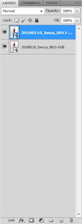
Close and save your photo and find it in Adobe Bridge or Adobe Lightroom. Open the image as a Smart Object. Once back in Photoshop, right click on the layers pallet and select New Smart Object Via Copy. Your Layers Pallet should look like this:


Double click the bottom layer and Adobe Camera Raw will come up. On the right you will see a bunch of sliders. Lower the contrast all the way and increase the fill light until you start to notice posterization around the edges (you'll know it when you see it because it looks bad). Click OK.

Double click the top layer and do the same thing (contrast and fill light) only this time, also convert it to grayscale. Do this by selecting the fourth tab and clicking the convert to grayscale button. Press OK.

Back in Photoshop, change the top layer's blend mode to Overlay. You should now see the effect in full force. You will most definitely have to fine-tune the image as it may appear too washed out. Simply double click each layer and play with the sliders until you get a combination you like. One tip though: Go into your grayscale layer and go back to that fourth tab. If you adjust the orange, red and yellow sliders to the left, you will darken the skin and prevent it from looking washed out.

That's just one of the many tricks I use on my pin-ups. Remember, there's no magic button that will give you the look you want, just a series of steps in the right direction. If you have any questions, you can e-mail me at tony@solisphotography.org or follow me on Facebook.

Tuesday, April 27, 2010

How to shoot a pin-up, part 2

Now that you've taken your pinup photo, it's time to do some processing. It's important to know that there is really no right way to process pinup photos. You just got to experiment until you get it looking the way you want. This tutorial is not for beginners. I'm assuming you have a basic understanding of layers, masks, paths and filters. You've been warned.

OK, first thing I always do is make a copy of my background layer and place it in a layer group called "Model." Hide the background layer. We're going to knock out everything but the model using the pen tool. Start a new path and trace around you model. Make sure you name your path so you can quit and come back to it if you need to. When I make my path, I usually stay a pixel or two inside the model to remove any fringe from my lens. In this example, my model is wearing feathery shorts. I'm ignoring the feathers and her hair for now, but I'm exact everywhere else. Also, do not include her shadows or reflections on the ground. We'll get to that later.


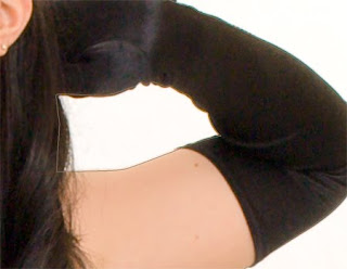
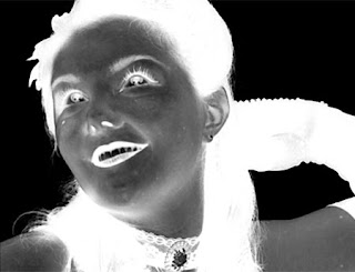
Once you have your basic path down, select it and create a layer mask for the layer group. Shift click the layer mask to hide it and go to your channels. Look at each of the channels and find the one with the best contrast between the hair and background. In my case, it was the green channel. Make a copy of this channel. Invert the new channel so the background is mostly black and the hair is mostly white. Select you paintbrush and set your foreground color to black and your flow to around 10 percent. Now set the mode to overlay (the brush mode). Paint black on the channel copy on the background of the image around the hair (and feather shorts in my case). You only need to focus on the areas you missed with the pen tool. Now switch your foreground color to white and paint over the hair until it looks like the image below.


Notice how I am only concentrating on the fringe of the hair. I've already masked out everything else.

Ctrl-click the channel to select it. Switch back to your layer group and shift-click the mask to activate it. Using white as your foreground, paint the hair back in. You may need to bring your flow back up to 100 percent, though I like to keep it low and use short brush strokes. You should now have a cutout of your model. Let's get the shadow and reflection now.

Duplicate your background layer again and rename it "Shadow." Place it under the "Model" layer group (not inside it). I removed the color from mine by hitting ctrl-shift-u but you can leave in any color if you like. Change the blend mode to multiply and add a layer mask. Hit ctrl-i to fill your mask with black. Now, using a soft white brush, paint in the areas that have the natural shadow. If your floor is too dark, use levels on the Shadow layer to brighten the whites a bit. All you need is a hint of the shadow to ground your model.

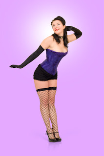
Next, create 2 solid color adjustment layers under your shadow layer. The one on top should be white and the one on the bottom should be your main color, in this case a light purple. Add a layer mask to your white layer so that only a soft round area appear behind your subject's head. Really, the main reason for this is to hide any flaws in the hair.

Your pin-up photo should look something like this now.

You really could stop here and you've got yourself a pretty good pin-up. With the right use of lighting and props, this might be all you need. It's a good place for me to stop today. Part 3 will cover some special effects to give your pin-up photo that pop it needs.


Part 3

This blog has moved


This blog is now located at http://solisphotography.blogspot.com/.
You will be automatically redirected in 30 seconds, or you may click here.

For feed subscribers, please update your feed subscriptions to
http://solisphotography.blogspot.com/feeds/posts/default.

Saturday, March 27, 2010

How to shoot a pin-up, part 1

So you want to shoot a pin-up? Can't say I blame you. Of all the photoshoots I've done, pin-ups are the most fun. The subjects have fun and they love the classic look. I say subjects because I've not shot a pin-up with a professional model. They are amateurs just out to have fun. You know what? You'll have fun too.

There are many tutorials online on how to shoot pin-ups and how to shoot against a white backdrop, so this will simply borrow from those and modified for what works for me.

THE SHOOT

The look I'm trying to get is that of a Vargas painting, so it helps to have a printout of poses to go for. Some, I've found are impossible for the average person. The body simply doesn't bend in real life the way it can in a drawing, so that's something to be aware of. Get yourself an Alberto Vargas book or search for images online.

I try to use a 50mm lens whenever I have the room to do so. For the average digital camera, this is the focal length that most closely resembles human sight. I don't want too much compression and I don't want to go too wide. I've used a wide-angle zoom when I didn't have enough room to use the 50mm, but I always tried to stay as close to 50mm as I could.

One of the many things to remember while you are shooting is to try to keep the front of the lens parallel to your subject to avoid distortion. And don't shoot from a standing position. Shoot from waste-high or even lower. This varies from subject to subject and depends on the pose.

During the shoot, have some music playing and try to keep things light. This should be fun for the both of you. A glass of wine helps loosen things up a bit, but always go with white since red wine will stain the teeth and tongue.

LIGHTING

Since we are trying to copy the look of a drawing, the lighting scheme we are going for is flat. This will fill in the shadows on the face and body and allow you to use your post-processing to get that painted look. If you will not be doing extensive post production, then you should light your photos how you see fit. One idea would be to use a color backdrop with a light pointed at the spot behind your subject's head and another light hitting her side from behind her for a nice rim light. This will give her a more 3-D look without having to do any post work.

becca lighting

Above is the lighting diagram for the scheme I use. I angled the two rear lights so that the backdrop meters two stops brighter than the subject using the reflective method (if using a white backdrop). In the above case, that means the backdrop metered at f/22. The subject metered at f/11 both from the front and rear using an incident meter. This is important to help prevent light spill over the edges of your subject. If you can't get your backdrop pure white, don't worry. In post we will drop the backdrop out. In a pinch, the rear lights are optional.

For my backdrop, I'm simply using a painter's drop. It's about $6 at home depot and I have one taped to the wall and one on the floor. Also on the floor is a 4' x 8' white tile board. It's $11 at Home Depot and is great for capturing shadows and reflection.

I shot this photo at 1/125, f/11, 100 ISO. If you are wondering why I chose to meter and shoot at f/11, it's because I wanted the entire subject to be sharp. F/16 would be even sharper, but I wanted to save a stop of light energy. Plus, my sensor was a little dirty and the dirt shows more the higher the f-stop number.

I shoot all my photos in RAW and catalog them in Adobe Lightroom. Normally, I do a lot of color correction in Lightroom but for pin-ups, I use Photoshop. The only thing I did in Lightroom to the below photo was lift the exposure 1/2 stop and use a medium contrast tone curve. Everything else is the Lightroom default, so the below image is pretty much straight out of the camera.


Part 2
Part 3

Wednesday, March 24, 2010

Help me with a redesign

For some time now I’ve been threatening to redesign my Web site but I’ve to the conclusion that it would take too much time away from my photography. So I’ve come up with a solution: get someone to do it for me.

The thing that gets tricky is that I can’t pay anyone, at least not in money. No, I’m willing to pay in photos.

You design a Web site for me and I will give you your very own photo shoot to use however you like. Family photos; pictures of your kids, wife or hubby; pin-ups; boudoir; cheesecake; beefcake; engagement; little Jimmy’s soccer game ... whatever you want with one exception: no weddings. It would help greatly if you are in the Monterey Bay Area or will be coming by at some point.

Included with the photoshoot will be 10 high-resolution retouched photos on CD for you to use how you see fit.

If you are interested, contact me at tony@solisphotography.org with your experience and design ideas. Have a look at my portfolio for inspiration at http://www.flickr.com/photos/solisphotography/sets/72157606174094212.